This week’s update is going to mostly detail a new feature that will soon be added to the game! Keep reading to find out more!

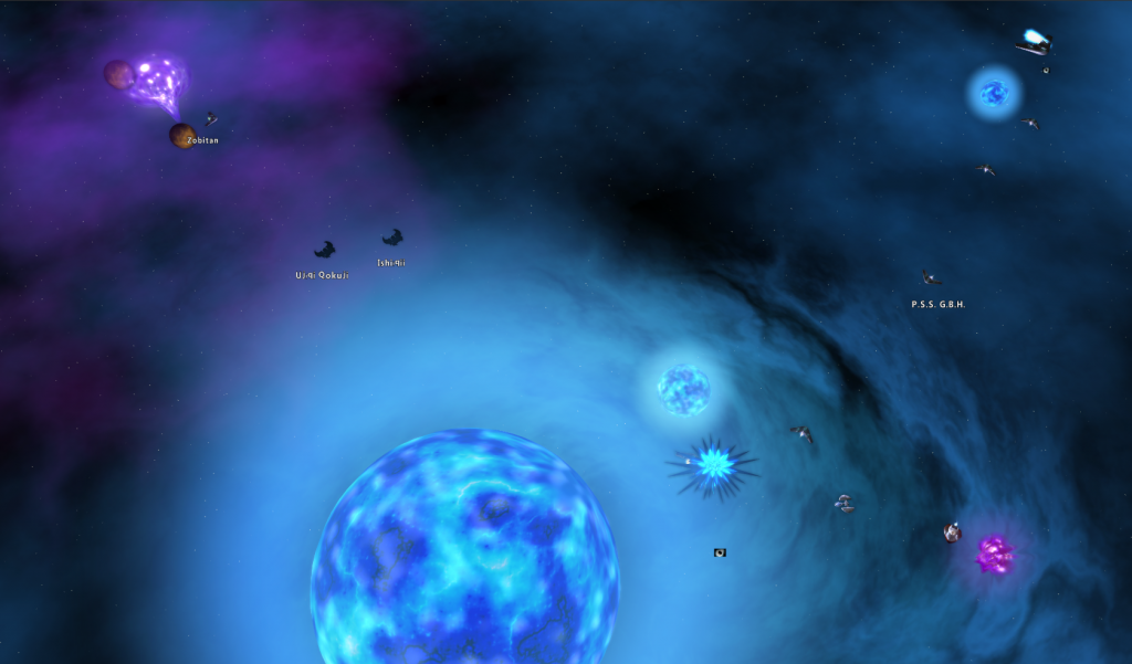
Firstly, something I forgot to mention last week when I announced Mira. With Mira I added a new mission feature that is used there and will no doubt see a fair amount of using going forward. This feature allows a mission to randomly assign another mission to a player on completion of the primary mission. In short, it means we can do randomly assigned dailies (like we have for T21 and T22) without the bulky mission item middleman!
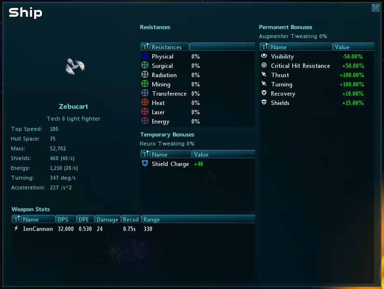
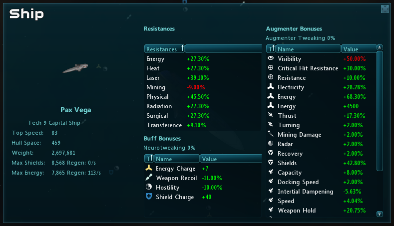
As for the new feature. If anyone has been watching the Suggestions system, they will have noticed that the status on the suggestion for Ship Statistics has been changed from Accepted to Underway. That’s because I’ve started working on it! Since this is the first user-submitted suggestion that’s started development, I think it would be interesting to tell everyone just what’s gone into that so far.
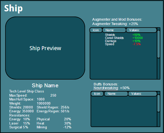
Everything started with the suggestion — which asked that we add in a way to view the stats of a players current ship; stuff like mods, augmenters, class skills, etc. From there, I made a mock-up in Google Docs. We tend to use Google Docs for a lot of stuff since it lets us work on designs collaboratively!

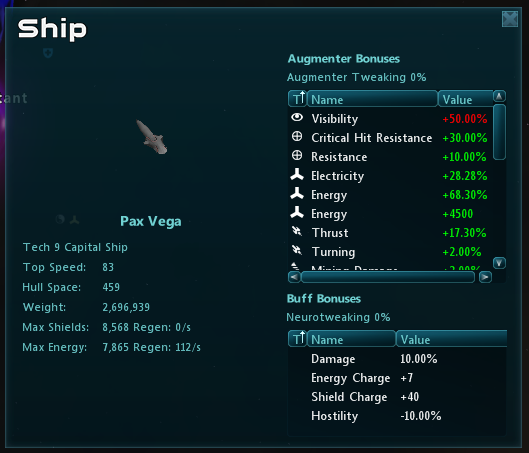
From the mock-up, the next stage was modifying the existing dialog so it could support all the new features. Since our GUI is skinnable, dialogs are saved in XML in the client folder. At this stage it’s all about re-sizing the existing window, adding a bunch of UI elements and positioning them properly. Once this is done we can start working on the signals from the client that will feed these elements, like lists and labels, all the useful information about your ship!

Before we can actually display the information though, the client needs to have it — which it doesn’t. That’s because it doesn’t have access to all the information about your ship, only what it needs to render it on the screen and display things like inventory and shield bars. It’s the server that has all the stats, buffs and other information needed to figure out things like damage. This means I had to make a few new client/server messages so the client could request the required information when the new dialog is opened, as well as ones from the server to send all that information back.
Once all this is finished, it’s time to start organizing and formatting the data so it’s a bit easier to read. To do this, I went with tables for stats and buffs and a list for the important stats you want to see at a glance, like resistances. I also added icons to the augmenter stats so you can tell at a glance what a stat modifies. For instance, a shield modifier has a shield icon since it directly modifies the values on that shield! I also colored the values so you can tell which modifiers are good and which are bad at a glance! After some internal feedback though, we decided the window was a bit cramped, so I widened it a bit so you can more easily see everything in it!

This window is still a work under construction and I am extremely open to more suggestions on how to make it even more useful for players. So definitely feel free to post feedback in the forums about this! That’s all I have for this week, I’ll be back next week with another update. Until then!
