Difference between revisions of "BlindSide Log"
(→May 13th) |
(→May 12th) |
||
| Line 12: | Line 12: | ||
Currently the background is placed on a flat billboard but I am considering moving this to a hemisphere/quarter-sphere(?) to create a more 3 dimensional feeling. | Currently the background is placed on a flat billboard but I am considering moving this to a hemisphere/quarter-sphere(?) to create a more 3 dimensional feeling. | ||
| + | |||
| + | [Smiley Comment] ''I assume the background will be the same each time you visit the same galaxy, correct? Its just generating the SAME nebula based on parameters set at universe creation, correct? I think the galaxies should keep their "look" from visit to visit.'' | ||
== May 13th == | == May 13th == | ||
Revision as of 02:19, 13 May 2009
BlindSide's Star Sonata Development Journal
May 12th
I've been improving the background generation on/off. On my Phenom 9950 system (2.6 ghz, Only using one core):
- Low/Medium settings take 60 milliseconds to generate the background nebula.
- High+ settings take ~400 milliseconds to generate the background nebula.
I may consider moving this to the gpu for better performance, as high settings systems will undoubtedly support this functionality (I would use the same code that creates the animated patterns on the suns, so it should be pretty damn fast). We'll see.
Currently the background is placed on a flat billboard but I am considering moving this to a hemisphere/quarter-sphere(?) to create a more 3 dimensional feeling.
[Smiley Comment] I assume the background will be the same each time you visit the same galaxy, correct? Its just generating the SAME nebula based on parameters set at universe creation, correct? I think the galaxies should keep their "look" from visit to visit.
May 13th
Finally it is lasers time! Lasers are certainly one of the more interesting graphics elements. Few methods/variations arise:
- Criss cross 2 billboards to create a beam effect, fairly simple.
No textures are needed here as we can just 2 more vertices and interpolate the vertex color from black at the edges to whatever the color is in the center.
- I could place one or two of those billboard volume light scene nodes on the beam to create a bit more variation,
I'm always meaning to use them somewhere but haven't found the place.
- A better idea would be to just use an elongated sphere and only render the bumps/animations on the lasers in the glow pass.
This should create a nice effect, I will probably try this method first.
- For wide area laser/tractory type things a cone with scrolling textures (Via texture matrices would be appropriate).
I will probably just use whatever texture is provided with C1 and scroll that along the 3 dimensional cone, should come out nice.
Well I am off to implement them and will hopefully have some screenshots in a few hours!
(Some time passes)
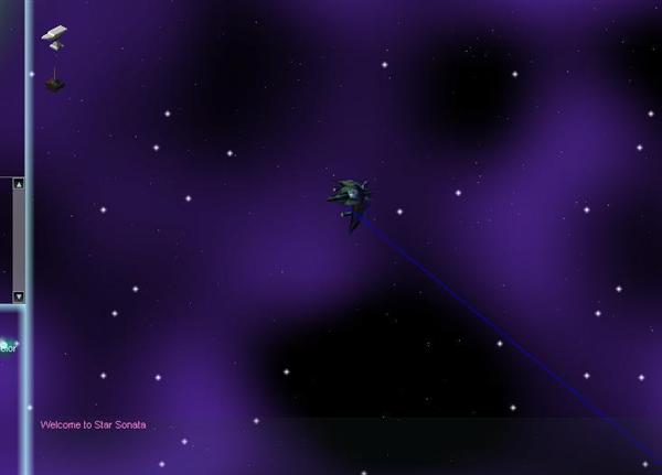
Ok, first of all, lets get acquainted with the Laser space objects. Process the start and endpoints and draw a simple line for debug output:
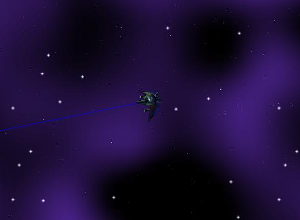
Oh dear that does not look right. Oh yes! The laser is using relative coordinates. Subtract that laser's position from the endpoint:
That's more like it!
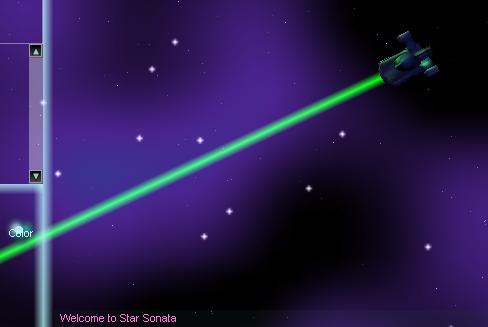
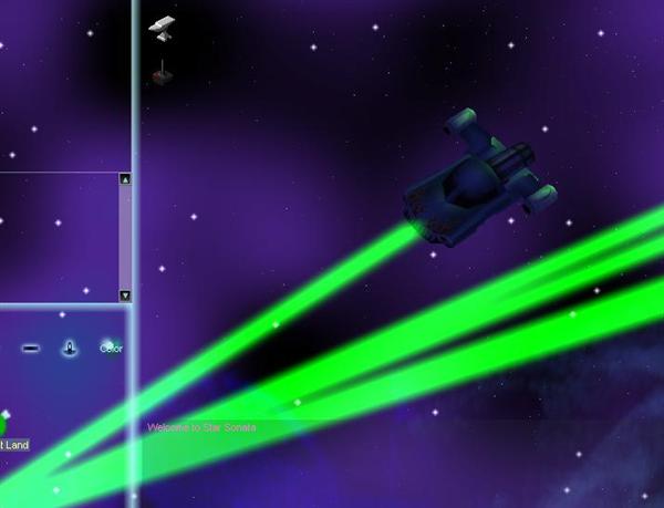
Now let's make it look more like a laser. After a bit of magic (And a complete re-write of an already available laser scene node for Irrlicht), we get something like this:
Now that's starting to look more like a laser! Let's try some glow and see what we get:
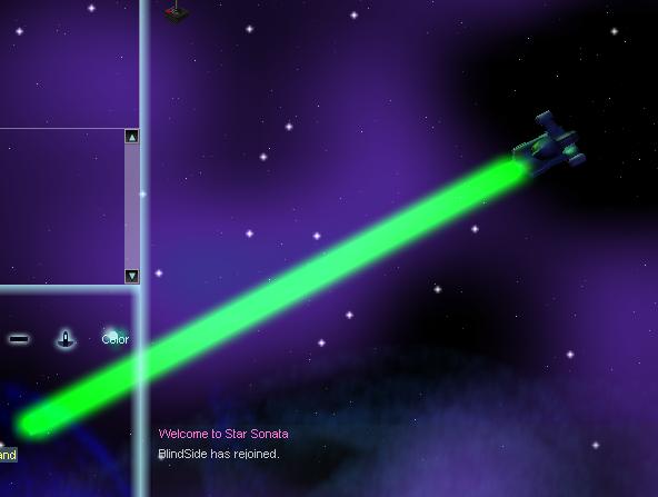
OK, maybe that's a little too much glow! Let's reduce the laser's radius when applying glow:
It's getting better! Next time we'll try adding a green light to the front of the ship when it fires a laser (Other surprises are in store!). That's all for today, stay tuned.
