Difference between revisions of "BlindSide Log"
(→May 12th) |
|||
| (20 intermediate revisions by 2 users not shown) | |||
| Line 1: | Line 1: | ||
= BlindSide's Star Sonata Development Journal = | = BlindSide's Star Sonata Development Journal = | ||
| − | == May | + | == May 29th == |
| − | + | LOG HAS MOVED: http://www.starsonata.com/forum/viewtopic.php?f=9&t=32706 | |
| − | - | + | == May 23rd == |
| − | - High | + | |
| + | More work on per-pixel lighting today. For those who know a thing or two about lighting mathematics, I scrapped the traditional attenuation formula for a simple (1.0 - distance / radius), works much better now. I also had a play around with a rim light (Originally intended for planet atmospheres but I think it tends to look nice on ships too.). A rim light is the fading white outline you see in the following image: | ||
| + | |||
| + | [[Image:RimLight.png]] | ||
| + | |||
| + | Believe it or not, there's still no bump mapping in that shot. Then again, I reckon that bumpmapping will have a more noticeable effect on things like planets and bigger ships. I'll hack that in and report back. | ||
| + | |||
| + | <nowiki>** Some Time Passes **</nowiki> | ||
| + | |||
| + | OK! Bump maps are in! | ||
| + | |||
| + | Here is a comparison using a shrimp (Top shows bumpmapping, bottom no bumpmapping): | ||
| + | |||
| + | [[Image:ShipBump.jpg]] | ||
| + | |||
| + | And a planet (Top shows bumpmapping again): | ||
| + | |||
| + | [[Image:PlanetBump.jpg]] | ||
| + | |||
| + | These are just preliminary results of course, I plan to add specular reflections to oceans on planets and lots of other goodies. See you next time on BSDL! (Yes I think an acronym sounds cooler...) | ||
| + | |||
| + | == May 21st == | ||
| + | |||
| + | Today I started on per-pixel lighting. I am supposed to go ahead and implement bumpmapping, rim lighting, and whatever effects I feel like stuffing in the shader to make it look pretty. | ||
| + | |||
| + | Now, what is per-pixel lighting? Let's start with a brief explanation: | ||
| + | |||
| + | In legacy graphics, lighting is calculated on a per-vertex level, for example, for your standard n dot l (normal dot product light direction) style lighting, it would be calculated for each vertex, based on the vertex normal, and then interpolated across the triangle. It typically produces ugly triangle shaped artifacts in under tessellated models (Models with a small amount of triangles). | ||
| + | |||
| + | Something like this (Images thanks to LightHouse3d): | ||
| + | |||
| + | [[Image:PointGL.gif]] | ||
| + | |||
| + | Per-pixel on the other hand, performs the operation on every pixel, without the need to interpolate the final result across the triangle. It's typically more computationally expensive, but the results speak for themselves: | ||
| + | |||
| + | [[Image:PointPix.gif]] | ||
| + | |||
| + | Here is a side by side comparison of just ordinary lighting applied to a Zebu (No bumpmaps). The one on the left is per-pixel and the one on the right is fixed function per-vertex lighting. Particularly near the cockpit you can make out how the per-pixel lighting approach produces a more distinct result, where as the lighting on the per-vertex version looks rather vague: | ||
| + | |||
| + | [[Image:ZebuPerPix.jpg]] | ||
| + | |||
| + | Please note that the per-pixel version is using slightly different material settings and therefore it is slightly darker. | ||
| + | |||
| + | Also, earlier in the forums I posted up a screenshot of the pax frigate. I think this is one of the ships that benefit the most in particular from per-pixel lighting. With the same viewing angle and position, this is the old shot: | ||
| + | |||
| + | [[Image:OldPaxFrigate.jpg]] | ||
| + | |||
| + | And this is the new (Note this was taken on Very High so it has anti-aliasing applied too unlike the old shot): | ||
| + | |||
| + | [[Image:NewPaxFrigate.jpg]] | ||
| + | |||
| + | That's all for today, folks. | ||
| + | |||
| + | == May 19th == | ||
| + | |||
| + | Added quite a few things since the last post, namely lightning style lasers. Jade Ion is now a combination of animated lightning and beam rather than a static custom image. I would post a screenshot but it won't do it justice, better to see it moving. Some lightning style lasers such as Really Big Laser are using pure lightning, and stuff like shield transference still use a static core texture (Screenshot in last post). | ||
| + | |||
| + | On the lasers side I've also added some particles that emit from the firing point to create a sort of muzzle effect. Will need to test this with really big lasers (I don't specifically refer to Really Big Laser here). | ||
| + | |||
| + | For explosions, I enhanced the look by using a seperate particle texture (And system), and made them only refract on ships. Sparklers take the sob size into account now, when available (Had to modify husk and spacebase to supply sizes to sparklers, as this was only implemented for explosions.). | ||
| + | |||
| + | Ok that's me for today, catch you next time on BlindSide Development Log! :P | ||
| + | |||
| + | [Pip Comment] - ''I think we should open this log to everyone BS, what do you think?'' | ||
| + | |||
| + | [BlindSide's response] - ''BlindSide's Star Sonata Development log grand opening! I like the sound of that. (I also like the sound of my own voice, lol)'' | ||
| + | |||
| + | == May 17th == | ||
| + | |||
| + | I spent more time fixing wormholes and a few other things today. I made a small video showing the two seperate parts of a wormhole, they are combined in the final product: http://irrlichtirc.g0dsoft.com/BlindSide/wh.wmv | ||
| + | |||
| + | Anyway enough about that, I added a cool bulge to lasers: | ||
| + | |||
| + | [[Image:LaserBulge.jpg]] | ||
| + | |||
| + | Particle effects: | ||
| + | |||
| + | [[Image:LaserParticle.jpg]] | ||
| + | |||
| + | Custom core textures: | ||
| + | |||
| + | [[Image:LaserYingYang.jpg]] | ||
| + | |||
| + | |||
| + | == May 16th == | ||
| + | |||
| + | Something was annoying me about the last screenshot, it's the hard end that the lasers have, it looks very unprofessional (Like the C1 lasers :P, not baggin' on C1 or anything). I scratched my head for some time on how to get rid of this without resorting to to textures (Which means scrapping the whole geometry idea and starting from scratch). Solution: More geometry! I think I am getting better at writing meshes by hand. Mind you I only added 3 vertices, but the end result speaks for itself: | ||
| + | |||
| + | [[Image:LaserDev7.jpg]] | ||
| + | |||
| + | Now to add some more variation as promised! | ||
| − | + | == May 14th == | |
| − | |||
| − | + | Lasers of course should have an overly bright bit in the center, so with some more hacking I got this: | |
| − | [ | + | [[Image:LaserDev6.jpg]] |
| − | + | Note that I don't use any textures for this, the laser is purely geometry and the color variation is from blending the vertex colors. This should in theory prove more efficient than a texture based solution, and more importantly it allows us to set any arbitary colors we want without extra hassle. | |
| − | == May 13th == | + | == May 13th == |
| − | Finally it is lasers time! Lasers are certainly one of the more interesting graphics elements. Few methods/variations arise: | + | Finally it is lasers time! Lasers are certainly one of the more interesting graphics elements. Few methods/variations arise: |
- Criss cross 2 billboards to create a beam effect, fairly simple. | - Criss cross 2 billboards to create a beam effect, fairly simple. | ||
| + | |||
No textures are needed here as we can just 2 more vertices and interpolate the vertex color from black at the edges to whatever the color is in the center. | No textures are needed here as we can just 2 more vertices and interpolate the vertex color from black at the edges to whatever the color is in the center. | ||
| − | |||
| − | |||
| − | |||
| − | |||
| − | |||
| − | |||
| − | + | - I could place one or two of those billboard volume light scene nodes on | |
| + | the beam to create a bit more variation, | ||
| + | |||
| + | I'm always meaning to use them somewhere but haven't found the place. | ||
| + | |||
| + | - A better idea would be to just use an elongated sphere and only render | ||
| + | the bumps/animations on the lasers in the glow pass. | ||
| + | |||
| + | This should create a nice effect, I will probably try this method first. | ||
| + | |||
| + | - For wide area laser/tractory type things a cone with scrolling textures | ||
| + | (Via texture matrices would be appropriate). | ||
| + | |||
| + | I will probably just use whatever texture is provided with C1 and scroll that along the 3 dimensional cone, should come out nice. | ||
| − | + | Well I am off to implement them and will hopefully have some screenshots in a few hours! | |
| − | Ok, first of all, lets get acquainted with the Laser space objects. Process the start and endpoints and draw a simple line for debug output: | + | (Some time passes) |
| + | |||
| + | Ok, first of all, lets get acquainted with the Laser space objects. Process the start and endpoints and draw a simple line for debug output: | ||
[[Image:LaserDev1.jpg]] | [[Image:LaserDev1.jpg]] | ||
| − | Oh dear that does not look right. Oh yes! The laser is using relative coordinates. Subtract that laser's position from the endpoint: | + | Oh dear that does not look right. Oh yes! The laser is using relative coordinates. Subtract that laser's position from the endpoint: |
| − | [[Image:LaserDev2.jpg]] | + | [[Image:LaserDev2.jpg]] |
| − | That's more like it! | + | That's more like it! |
| − | Now let's make it look more like a laser. After a bit of magic (And a complete re-write of an already available laser scene node for Irrlicht), we get something like this: | + | Now let's make it look more like a laser. After a bit of magic (And a complete re-write of an already available laser scene node for Irrlicht), we get something like this: |
| − | [[Image:LaserDev3.jpg]] | + | [[Image:LaserDev3.jpg]] |
| − | Now that's starting to look more like a laser! Let's try some glow and see what we get: | + | Now that's starting to look more like a laser! Let's try some glow and see what we get: |
| − | [[Image:LaserDev4.jpg]] | + | [[Image:LaserDev4.jpg]] |
| − | OK, maybe that's a little too much glow! Let's reduce the laser's radius when applying glow: | + | OK, maybe that's a little too much glow! Let's reduce the laser's radius when applying glow: |
| − | [[Image:LaserDev5.jpg]] | + | [[Image:LaserDev5.jpg]] |
| − | It's getting better! Next time we'll try adding a green light to the front of the ship when it fires a laser (Other surprises are in store!). That's all for today, stay tuned. | + | It's getting better! Next time we'll try adding a green light to the front of the ship when it fires a laser (Other surprises are in store!). That's all for today, stay tuned. |
| − | [Pip Comment] - ''Starting to look very nice. Any way to add a bit of variation up and down the beam?'' | + | [Pip Comment] - ''Starting to look very nice. Any way to add a bit of variation up and down the beam?'' |
[BlindSide response] - ''Thanks for your comment pip! The lasers will indeed get some variation once the basic look is perfected.'' | [BlindSide response] - ''Thanks for your comment pip! The lasers will indeed get some variation once the basic look is perfected.'' | ||
| − | == May | + | == May 12th == |
| − | + | I've been improving the background generation on/off. On my Phenom 9950 system (2.6 ghz, Only using one core): | |
| − | + | - Low/Medium settings take 60 milliseconds to generate the background nebula. | |
| − | + | - High+ settings take ~400 milliseconds to generate the background nebula. | |
| − | |||
| − | + | I may consider moving this to the gpu for better performance, as high settings systems will undoubtedly support this functionality (I would use the same code that creates the animated patterns on the suns, so it should be pretty damn fast). We'll see. | |
| − | + | Currently the background is placed on a flat billboard but I am considering moving this to a hemisphere/quarter-sphere(?) to create a more 3 dimensional feeling. | |
| − | [ | + | [Smiley Comment] ''I assume the background will be the same each time you visit the same galaxy, correct? Its just generating the SAME nebula based on parameters set at universe creation, correct? I think the galaxies should keep their "look" from visit to visit.'' |
| − | + | [BlindSide reply] ''Thanks for the comment Smiley! That is correct, the nebula generator currently uses the galaxy id as the seed for the generation, so visiting the same galaxy twice would give you the same look and colors. '' | |
| − | [[Category: | + | [[Category:Client_2_Dev]] |
Latest revision as of 06:49, 30 May 2009
Contents
BlindSide's Star Sonata Development Journal
May 29th
LOG HAS MOVED: http://www.starsonata.com/forum/viewtopic.php?f=9&t=32706
May 23rd
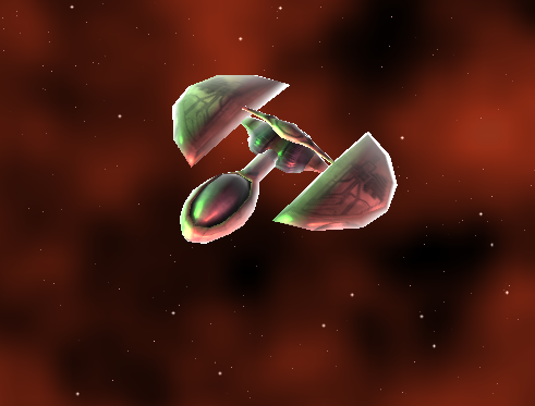
More work on per-pixel lighting today. For those who know a thing or two about lighting mathematics, I scrapped the traditional attenuation formula for a simple (1.0 - distance / radius), works much better now. I also had a play around with a rim light (Originally intended for planet atmospheres but I think it tends to look nice on ships too.). A rim light is the fading white outline you see in the following image:
Believe it or not, there's still no bump mapping in that shot. Then again, I reckon that bumpmapping will have a more noticeable effect on things like planets and bigger ships. I'll hack that in and report back.
** Some Time Passes **
OK! Bump maps are in!
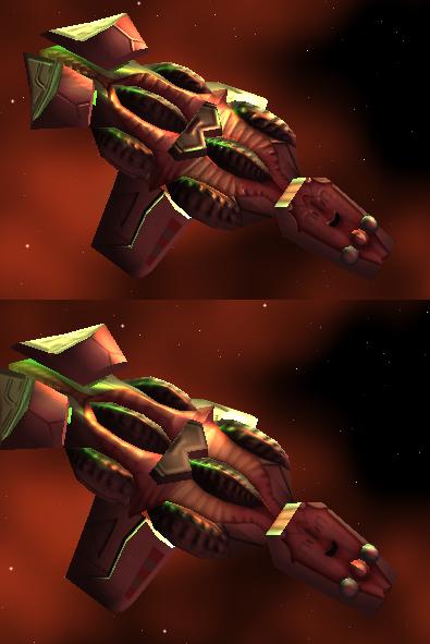
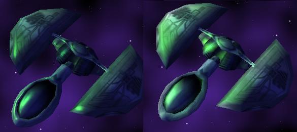
Here is a comparison using a shrimp (Top shows bumpmapping, bottom no bumpmapping):
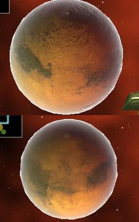
And a planet (Top shows bumpmapping again):
These are just preliminary results of course, I plan to add specular reflections to oceans on planets and lots of other goodies. See you next time on BSDL! (Yes I think an acronym sounds cooler...)
May 21st
Today I started on per-pixel lighting. I am supposed to go ahead and implement bumpmapping, rim lighting, and whatever effects I feel like stuffing in the shader to make it look pretty.
Now, what is per-pixel lighting? Let's start with a brief explanation:
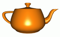
In legacy graphics, lighting is calculated on a per-vertex level, for example, for your standard n dot l (normal dot product light direction) style lighting, it would be calculated for each vertex, based on the vertex normal, and then interpolated across the triangle. It typically produces ugly triangle shaped artifacts in under tessellated models (Models with a small amount of triangles).
Something like this (Images thanks to LightHouse3d):
Per-pixel on the other hand, performs the operation on every pixel, without the need to interpolate the final result across the triangle. It's typically more computationally expensive, but the results speak for themselves:
Here is a side by side comparison of just ordinary lighting applied to a Zebu (No bumpmaps). The one on the left is per-pixel and the one on the right is fixed function per-vertex lighting. Particularly near the cockpit you can make out how the per-pixel lighting approach produces a more distinct result, where as the lighting on the per-vertex version looks rather vague:
Please note that the per-pixel version is using slightly different material settings and therefore it is slightly darker.
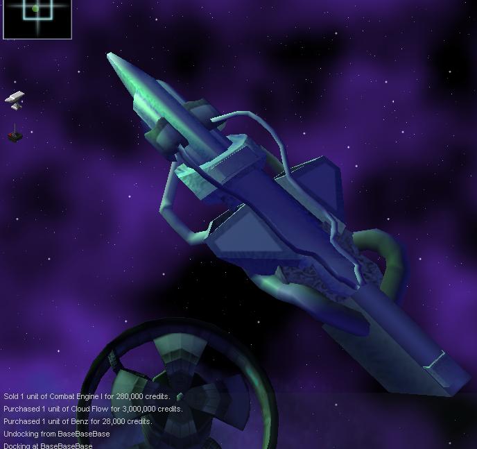
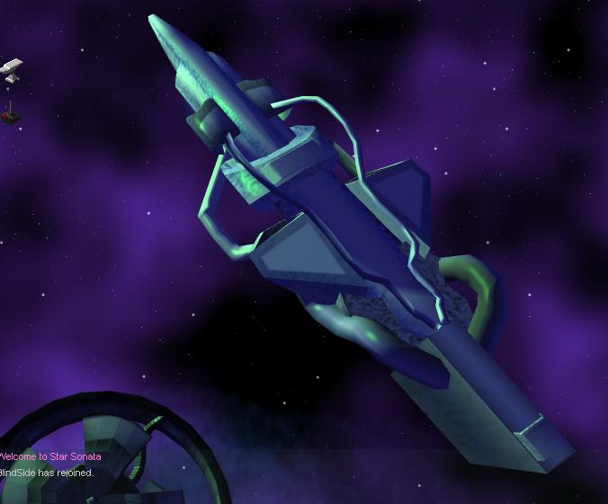
Also, earlier in the forums I posted up a screenshot of the pax frigate. I think this is one of the ships that benefit the most in particular from per-pixel lighting. With the same viewing angle and position, this is the old shot:
And this is the new (Note this was taken on Very High so it has anti-aliasing applied too unlike the old shot):
That's all for today, folks.
May 19th
Added quite a few things since the last post, namely lightning style lasers. Jade Ion is now a combination of animated lightning and beam rather than a static custom image. I would post a screenshot but it won't do it justice, better to see it moving. Some lightning style lasers such as Really Big Laser are using pure lightning, and stuff like shield transference still use a static core texture (Screenshot in last post).
On the lasers side I've also added some particles that emit from the firing point to create a sort of muzzle effect. Will need to test this with really big lasers (I don't specifically refer to Really Big Laser here).
For explosions, I enhanced the look by using a seperate particle texture (And system), and made them only refract on ships. Sparklers take the sob size into account now, when available (Had to modify husk and spacebase to supply sizes to sparklers, as this was only implemented for explosions.).
Ok that's me for today, catch you next time on BlindSide Development Log! :P
[Pip Comment] - I think we should open this log to everyone BS, what do you think?
[BlindSide's response] - BlindSide's Star Sonata Development log grand opening! I like the sound of that. (I also like the sound of my own voice, lol)
May 17th
I spent more time fixing wormholes and a few other things today. I made a small video showing the two seperate parts of a wormhole, they are combined in the final product: http://irrlichtirc.g0dsoft.com/BlindSide/wh.wmv
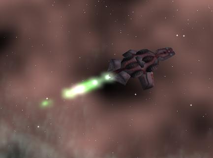
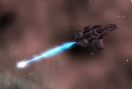
Anyway enough about that, I added a cool bulge to lasers:
Particle effects:
Custom core textures:
May 16th
Something was annoying me about the last screenshot, it's the hard end that the lasers have, it looks very unprofessional (Like the C1 lasers :P, not baggin' on C1 or anything). I scratched my head for some time on how to get rid of this without resorting to to textures (Which means scrapping the whole geometry idea and starting from scratch). Solution: More geometry! I think I am getting better at writing meshes by hand. Mind you I only added 3 vertices, but the end result speaks for itself:
Now to add some more variation as promised!
May 14th
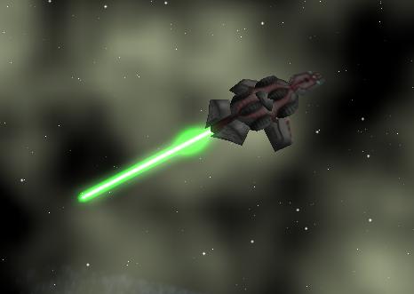
Lasers of course should have an overly bright bit in the center, so with some more hacking I got this:
Note that I don't use any textures for this, the laser is purely geometry and the color variation is from blending the vertex colors. This should in theory prove more efficient than a texture based solution, and more importantly it allows us to set any arbitary colors we want without extra hassle.
May 13th
Finally it is lasers time! Lasers are certainly one of the more interesting graphics elements. Few methods/variations arise:
- Criss cross 2 billboards to create a beam effect, fairly simple.
No textures are needed here as we can just 2 more vertices and interpolate the vertex color from black at the edges to whatever the color is in the center.
- I could place one or two of those billboard volume light scene nodes on
the beam to create a bit more variation,
I'm always meaning to use them somewhere but haven't found the place.
- A better idea would be to just use an elongated sphere and only render
the bumps/animations on the lasers in the glow pass.
This should create a nice effect, I will probably try this method first.
- For wide area laser/tractory type things a cone with scrolling textures
(Via texture matrices would be appropriate).
I will probably just use whatever texture is provided with C1 and scroll that along the 3 dimensional cone, should come out nice.
Well I am off to implement them and will hopefully have some screenshots in a few hours!
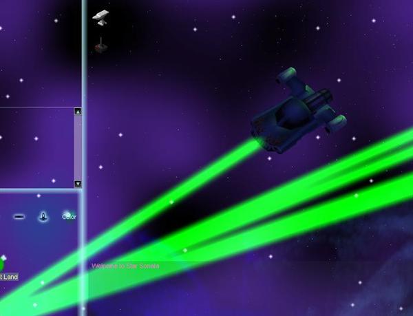
(Some time passes)
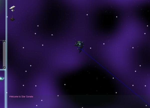
Ok, first of all, lets get acquainted with the Laser space objects. Process the start and endpoints and draw a simple line for debug output:
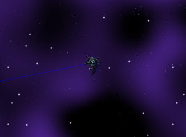
Oh dear that does not look right. Oh yes! The laser is using relative coordinates. Subtract that laser's position from the endpoint:
That's more like it!
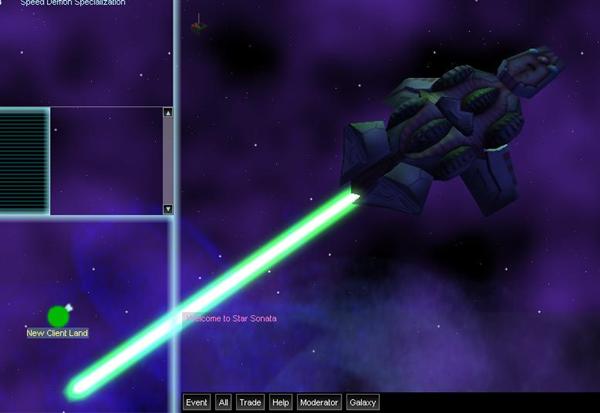
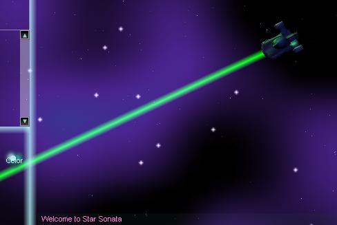
Now let's make it look more like a laser. After a bit of magic (And a complete re-write of an already available laser scene node for Irrlicht), we get something like this:
Now that's starting to look more like a laser! Let's try some glow and see what we get:
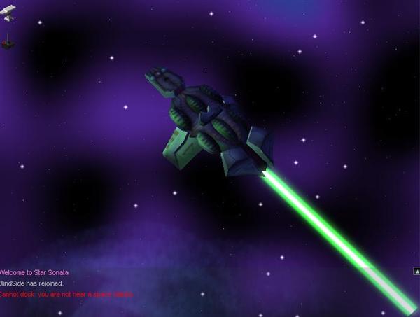
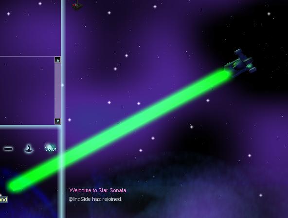
OK, maybe that's a little too much glow! Let's reduce the laser's radius when applying glow:
It's getting better! Next time we'll try adding a green light to the front of the ship when it fires a laser (Other surprises are in store!). That's all for today, stay tuned.
[Pip Comment] - Starting to look very nice. Any way to add a bit of variation up and down the beam?
[BlindSide response] - Thanks for your comment pip! The lasers will indeed get some variation once the basic look is perfected.
May 12th
I've been improving the background generation on/off. On my Phenom 9950 system (2.6 ghz, Only using one core):
- Low/Medium settings take 60 milliseconds to generate the background nebula.
- High+ settings take ~400 milliseconds to generate the background nebula.
I may consider moving this to the gpu for better performance, as high settings systems will undoubtedly support this functionality (I would use the same code that creates the animated patterns on the suns, so it should be pretty damn fast). We'll see.
Currently the background is placed on a flat billboard but I am considering moving this to a hemisphere/quarter-sphere(?) to create a more 3 dimensional feeling.
[Smiley Comment] I assume the background will be the same each time you visit the same galaxy, correct? Its just generating the SAME nebula based on parameters set at universe creation, correct? I think the galaxies should keep their "look" from visit to visit.
[BlindSide reply] Thanks for the comment Smiley! That is correct, the nebula generator currently uses the galaxy id as the seed for the generation, so visiting the same galaxy twice would give you the same look and colors.
